Ethnic Diversity Map Shows Where Not To Visit
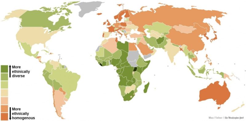
Back in 2013, some scientists at Harvard University studied the diversity worldwide and created a world ethnic diversity map that provides an interesting counterpoint to our endless “diversity is our strength” rhetoric:
Another word for it might be diversity. They gauged this by asking an elegantly simple question: If you called up two people at random in a particular country and ask them their ethnicity, what are the odds that they would give different answers? The higher the odds, the more ethnically “fractionalized” or diverse the country.
I’ve mapped out the results above. The greener countries are more ethnically diverse and the orange countries more homogenous. There are a few trends you can see right away: countries in Europe and Northeast Asia tend to be the most homogenous, sub-Saharan African nations the most diverse. The Americas are generally somewhere in the middle. And richer countries appear more likely to be homogenous.
This gets fascinating when we compare it to a map of self-reported tolerance worldwide:
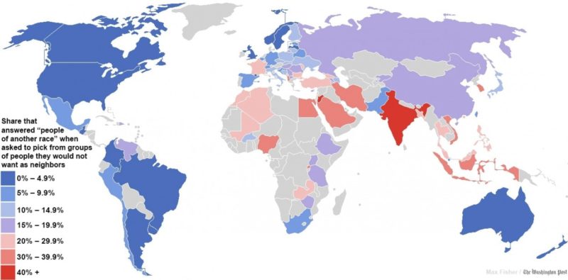
More than anything else, here we see where political pretense has taken over and people are afraid to report anything except “yes, diversity is our strength, comrade!” What is interesting is that relatively non-diverse Western European countries were the most accepting of diversity.
Their leaders took them at face value, and quickly imported millions of third world laborers to — they hoped — work and pay high taxes that would fund the lavish entitlements state that has run itself into bankruptcy giving “free” benefits to voters.
We wonder, of course, how different the results would be if polled today. A cynical guess: not at all. When you know an opinion is taboo, you never express it except when far from prying ears, just like in the Soviet Union.
Tags: diversity, diversity is our strength, tolerance


![]()


- Popular
- Crowdism
- Ethnomasochism
- The Increasing Mediocrity Of Everything
- The Alt Right Is Tired Of Living In Mordor
- Nihilism Is The Basis Of Conservatism
- The Nationalism FAQ
- Beyond the Absolute
- Conservationism Versus Environmentalism
- The Self-Inventing Totalitarian State
- The Biological Basis Of Race
- Whites Going Their Own Way
- How Individualism Defeats Conservatism